Duckworth developed the “Grit Scale” and has found that a person’s grit score is highly predictive of achievement under challenging circumstances.
In this post I will employ a statistics-based argument that money begets money. Don’t worry, I’ll get back to blathering unquantifiable bullshit soon, but this is worth it!
Angela Duckworth is a world-class research psychologist at the University of Pennsylvania who is famous for her work on grit (perseverance and determination). When she is not traveling around the world giving hilarious lectures, she is my statistics professor, which is pretty awesome for me.
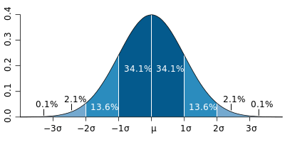
In our last class, she was describing what you can learn about data just by looking at its shape on a graph. For instance, why is the “normal distribution” important? What causes the curved shape that you see below to come about?  She showed us this 6 second video in which thousands of little beads are poured over a bunch of nails. When a bead hits each nail, 50% of the beads will go right, and 50% will go left. There are many more paths to get to the center of the distribution, and those on the wings have to be really un/lucky and get bounced the same way each time. And, because there are so many beads and so many factors involved, they tend to balance themselves out and by the end you get a perfectly normal distribution—the bell curve. In other words, the normal distribution is a result of a bunch of unbiased factors that sort out any given population.
So, I wondered, what is the pattern of income distribution in the United States? If it was a normal distribution, that would mean the top of the bell curve would be $51,914, the median income of the country (2011 US Census). Within one standard deviation (the average distance from the median income), you would find 68.2% of the country, as we did in the graph above and in the probability machine video. That majority would be flanked by 27% on the sides with about 4% in the extreme wings. In general we would want the standard deviation to be small, as this would point to greater income equality; people’s incomes would be closer to each other. As you can see in the graph below, more of the population is in the wings for the dark blue line, which would mean incomes would be further away from each other. The light blue line would be preferred, where people have less disparate incomes.
But what we see in the United States today is not close.
The data is skewed left. I scoured the internet for a graph that was 100% representational of our income distribution, but that proved to be as likely as finding a to-scale model of the solar system: it’s just too big. Those big bars on the right need to be spread out like the rest of the graph all the way to casino tycoon Sheldon Adelson who made about something around 7.2 billion this year (Forbes). Which means this graph is only representational of 0.0027% of the US household income distribution curve. In other words, if this graph spans 6 inches across your screen, you would need a computer screen 18,000 feet wide to see the full distribution (0.5ft/0.000027).

Sheldon Adleson is the chairman of the Las Vegas Sands Corporation, the parent company of Venetian Macao Limited which operates The Venetian Resort Hotel Casino and the Sands Expo and Convention Center. He also owns the Israeli daily newspaper Israel HaYom. He made $21.6 billion in the last three years.
What does this mean?
Let’s go back to the youtube video and the beads bouncing off the nails. From the basic statistics that I understand, radically skewed distribution implies that the history of beads matter. If the the bead had bounced lucky last time, it was more likely to bounce lucky again, and vice versa. This makes sense to me. It is much more difficult to go from an income of $30,000/year to $40,000/year, than it is to go from $1,000,000,000/year to $1,000,010,000/year. In other words, the further down the road to wealth you are, the more likely you are going downhill.
So, I have advice for those looking to make more money; the first step to making money is having money. The rich get richer. Of course, there are plenty of exceptions.
I am sending this post to Professor Duckworth and my assistant professor, Peggy Kearn. I want to hear what they think and see if there are any other conclusions we might draw from the shape of income distribution in America.


